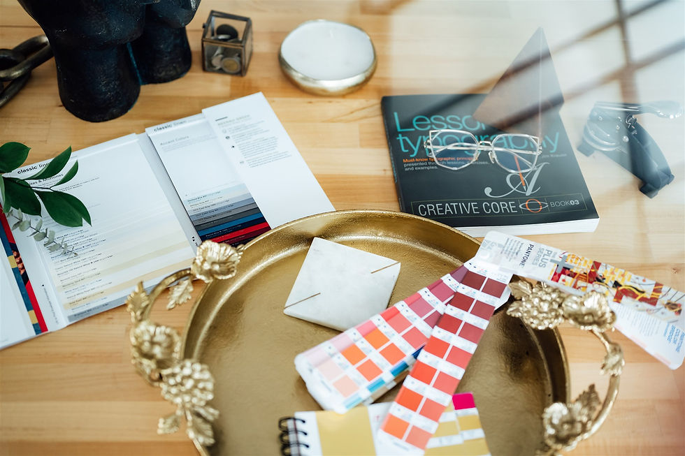
Your colours are one of your most powerful tools in creating an atmosphere that will have your customers feeling at home in your brand. There is a direct correlation between your brand’s palette and how customers perceive you, influencing purchasing behaviour. Your colours are too critical of a business decision to be determined simply by personal preference. Without research and intentionality, choosing the wrong brand colours is a missed opportunity at best and could harm your brand’s reputation at worst. Read on for our guidance on how to choose your brand colours well.

Step 1 | Revisit Your Brand’s Purpose, Positioning, and Personality
Before committing to any visual direction, it is crucial to have clarity on the foundational elements of your brand. This means that your core values are clearly defined, you know how you differentiate yourself in your competitive landscape, and you’ve determined how your brand would behave if it were a person. Is your brand playful or serious? Is it loud or subdued? Delicate or strong-willed? Within milliseconds, your colours will communicate a feeling and set a vibe, telling people what they can expect from your business. Your palette choices are crucial to aligning with the adjectives you would like associated with your brand.
Once you clearly understand your brand personality, you can start matching these traits to their corresponding colours. Each colour and its shades, tones, and tints carry a particular association. For example, blue is often used to represent reliability, while red indicates passion and excitement. Purple often reflects luxury, while black is perceived as powerful and sophisticated. For a detailed description of the full rainbow, read our article on The Psychology of Colour. This should give you an excellent base to work with. Then you can continue the process in this article to massage the preliminary, strategically informed palette you have just created.
Step 2 | Consider Your Target Audience
Your colours should evoke the right emotions in your target customer, according to your industry. Disparate groups of people will react differently when faced with a specific palette. For example, if you are selling toys to children, having a playful and youthful palette filled with vibrant and bold tones would capture attention and serve you well. However, if you’re an accounting firm that caters to older clientele and needs those people to trust and respect you, that same colour scheme might do more harm than good.
Step 3 | Conduct Visual Research & Find Inspiration
Every great strategic business move begins with research. Though you may already have some ideas about what colours you want as a part of your brand, it is helpful to see what is out there before you commit. Firstly, you want to audit your field. Is there a standard colour? Why? Perhaps the common shades perfectly capture the atmosphere needed for your business’s success. Or maybe, you would like to visually differentiate yourself by moving in a different direction from your competitors’ colours. Additionally, through the study of visuals being used elsewhere, you may find interesting colour combinations you’ve never thought of before. One of our favourite things to do here at the Atelier is to take a colour picker to a beautiful photo whose tonal qualities capture the essence of the brand we are designing for.
Step 4 | Create Palette Guidelines
Your brand should have a primary colour used most often and approximately two to three accent colours for variation. Additionally, we recommend choosing a neutral (likely a soft grey or beige) background when using a stark black and white is too harsh. Lastly, if relevant to your business, you can choose a metal. Determining if silver, gold, bronze, rose gold or copper mixes best with your colours can help if you have a brick-and-mortar location or if you are foiling on print collateral. As you build out your palette, keep in mind that if you have too many colours, you risk lacking consistency and appearing unprofessional. If you have too few, it could be stifling when you try to design for your brand. The most successful brand palettes consist of colours that work well together as a set and are specific enough that people begin to associate particular hues with your business.
Choosing a brand colour palette blends many considerations. Though you should like your brand colours, your personal preference isn’t wise to lean too heavily on for this specific exercise. Like all brand visuals, it should start with introspective thoughts about your business’s reason for being and take marketing strategy into account. Have you been workshopping your brand identity? Consider looking at our Essential Guide To Visual Branding, where we guide you through a series of worksheets, questionnaires, and detailed readings to help you craft a beautiful visual identity that will be effective in helping you reach your business goals.
For more information about working with us, reach out at atelier@oluwatosin.net.
Comments